

Ensure That Text Is Easy to Read
On this page
Here are some general recommendations to help improve the presentation and legibility of your text:
Typeface
Selecting an appropriate typeface is essential to ensure ease of reading. Regardless of whether the typeface is intended to appear decorative or plain, it is crucial that legibility is prioritized above all else.
Don’t
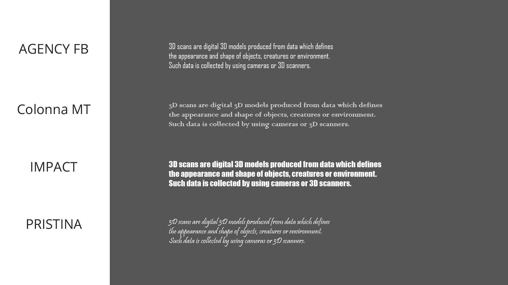
Here are some examples of typefaces that are difficult to read.
Do
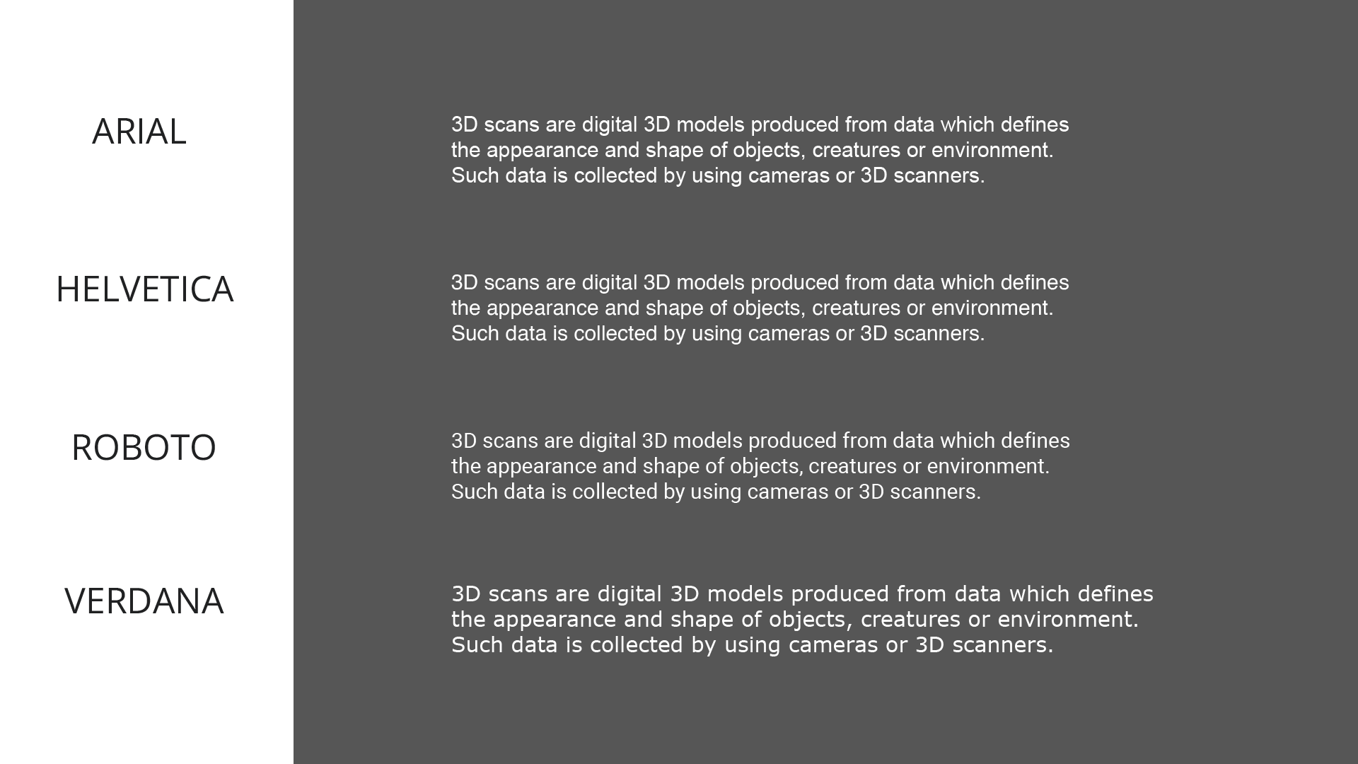
Here are some examples of typefaces that are easy to read.
Regarding the choice between serif and sans serif typefaces, there is no universally preferred option in terms of legibility. Sans serif typefaces, which lack the decorative features known as “feet” and “tails,” may appear easier to read on screens. However, preferences for serif or sans serif typefaces can vary significantly among players. Sans serif typefaces are commonly used in software applications, which contributes to their modern and informal feel. Conversely, serif typefaces tend to convey a more traditional, old-fashioned, and formal aesthetic.
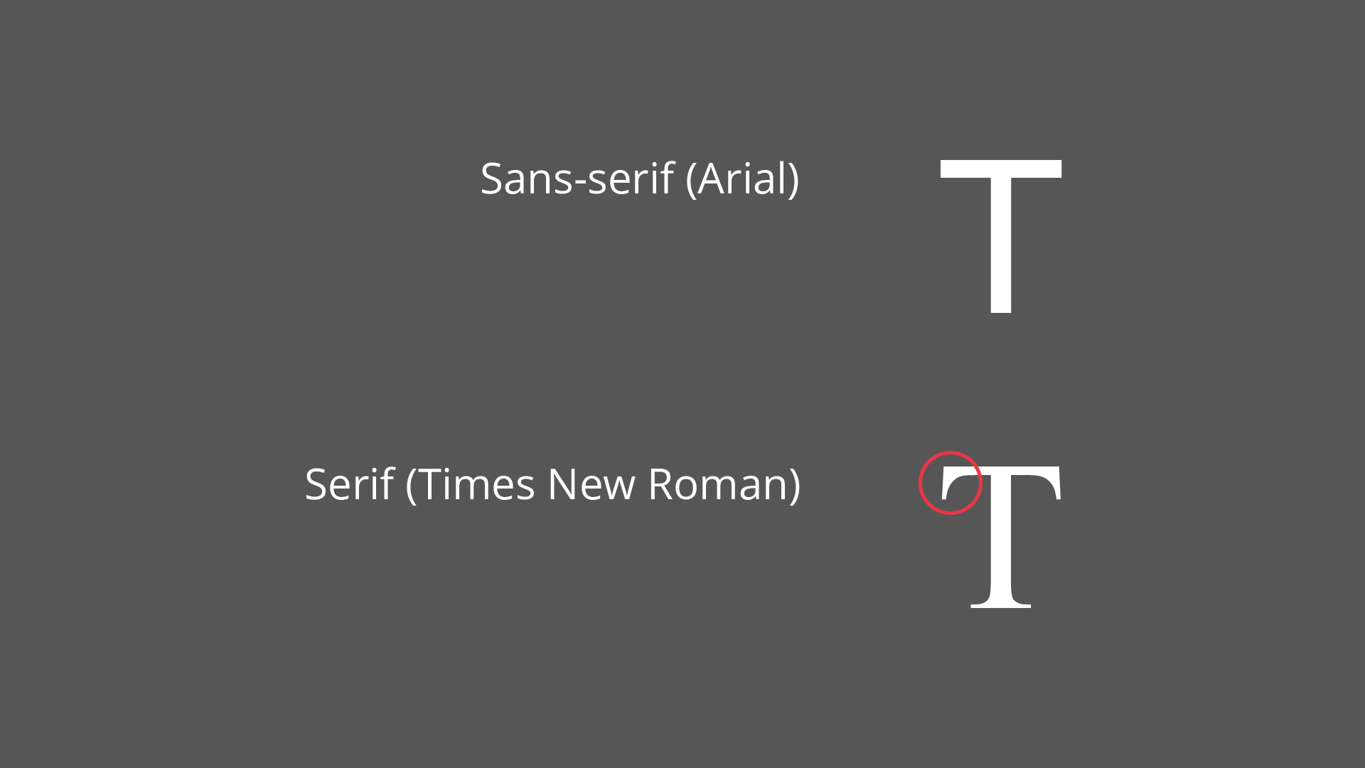
Arial is a sans serif typeface, whereas Times New Roman is a serif typeface. The illustration highlights one of the serifs in Times New Roman.
Given that some players may have dyslexia, consider offering an alternative typeface specifically designed to support dyslexic readers in addition to the default typeface.
Alignment
Text alignment determines how text is positioned on the screen. It may be aligned to the left, to the right, or centered.
Align text to the left in the following scenarios:
In bulleted and numbered lists.
In Tacoma, bulleted lists are left-aligned.
Credit: The Fullbright Company. Screenshot captured by the author.
- In paragraphs.
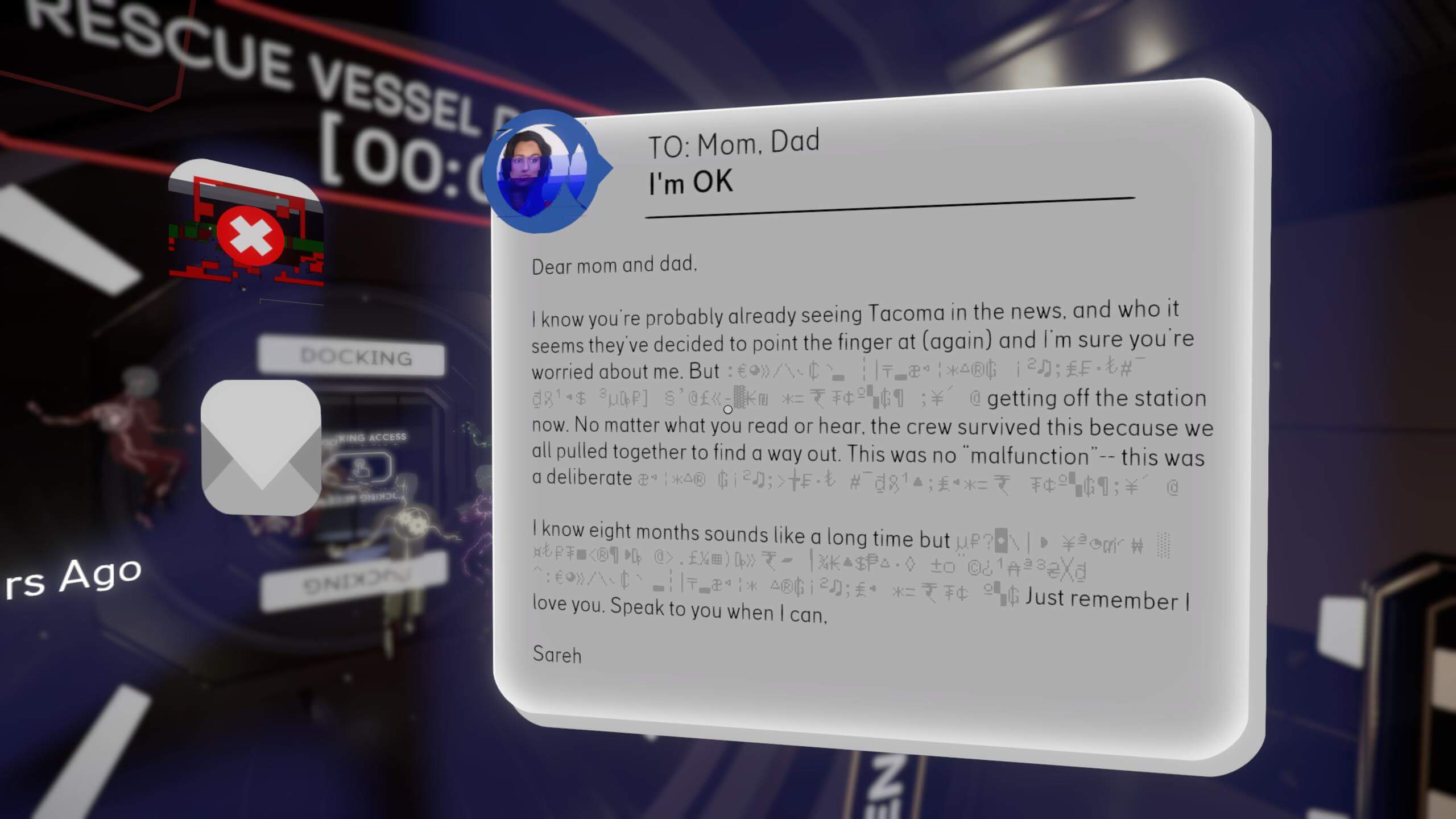
In Tacoma, paragraphs are also aligned to the left.
Credit: The Fullbright Company. Screenshot captured by the author.
When the text appears to the right of a relevant graphical element.
Align text to the right when it appears to the left of a relevant graphical element.
Align text to the center in the following scenarios:
Titles.
Precautionary statements that inform players of potential hazards.
Error messages.
Short instructions.
Capitalization
Use a combination of lowercase (a, b, c) and uppercase (A, B, C) letters. Only use all capital letters (uppercase) when presenting acronyms. Text written entirely in uppercase letters is generally more difficult to read and should be avoided for longer words or sentences.
Color Contrast
Ensuring a high contrast in luminance between text and its background is a critical factor in achieving good legibility. Insufficient contrast may hinder players’ ability to read on-screen text, potentially obstructing progress within the game. To facilitate the selection of suitable color combinations, various software tools—commonly referred to as “color contrast checkers and analyzers”—are available. These tools evaluate the contrast ratio of a selected text section against its background and determine whether it meets the contrast requirements specified in the Web Content Accessibility Guidelines (WCAG).
Appropriate color contrast is necessary to ensure that text:
Stands out clearly from its background.
Remains legible and easy to interpret.
There may be instances where achieving a contrast ratio that complies with WCAG standards is not feasible due to factors such as:
The background is non-uniform.
The background luminance is dynamic or inconsistent.
In such cases, you may apply the following techniques to enhance legibility:
Outlines
If you wish to retain both the current text and background colors but face legibility issues, applying outlines to the text is an effective solution. A widely used approach is to combine black text with white outlines or vice versa.

In Gone Home, interactive objects display white text with black outlines when the cursor hovers over them.
Credit: The Fullbright Company. Screenshot captured by the author.
Semi-Opaque Layer
As an alternative to using text outlines, you may place a semi-opaque layer between the text and its background. This layer can be grey or colored, depending on what best complements your visual design.
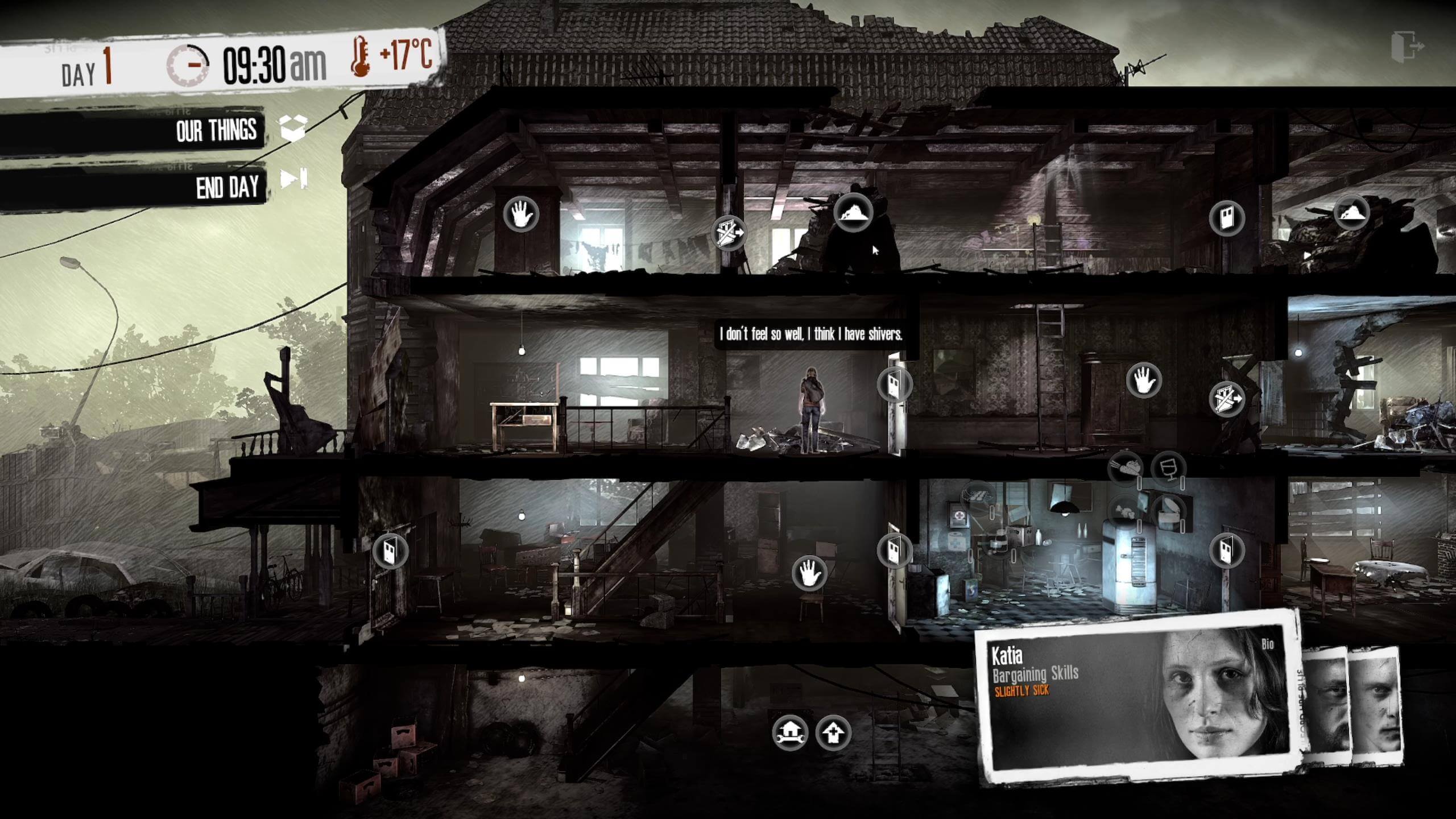
In This War of Mine, character messages are rendered on a black semi-opaque layer, with white text over it. This combination provides excellent contrast.
Credit: 11 bit studios S.A.. Screenshot captured by the author.
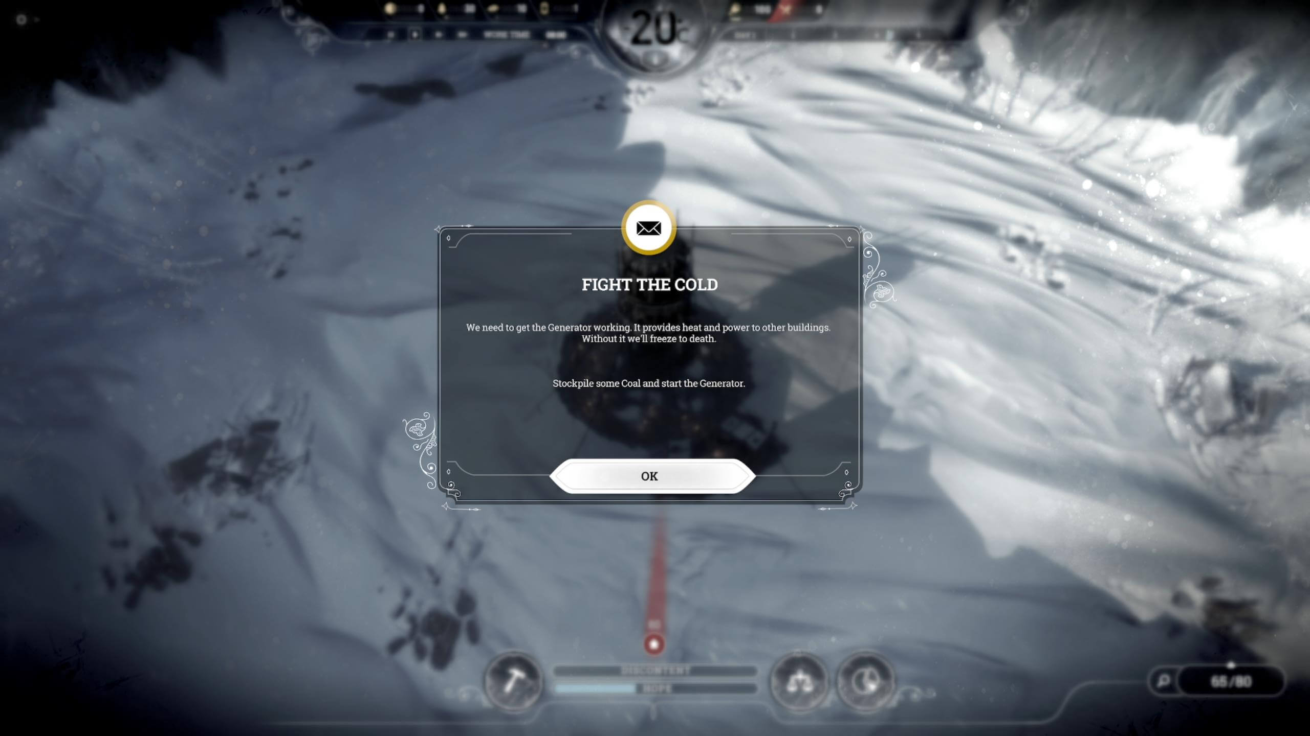
In Frostpunk, the message “Fight the cold” appears within a semi-transparent box, enhancing readability.
Credit: 11 bit studios S.A.. Screenshot captured by the author.
Encoding
Ensure that all characters are correctly displayed across every language version your game supports. Proper encoding is essential for international accessibility and clarity.
Importance
To emphasize specific words or segments of text, bold or vibrant colors may be used. These colors should be bright and noticeable.
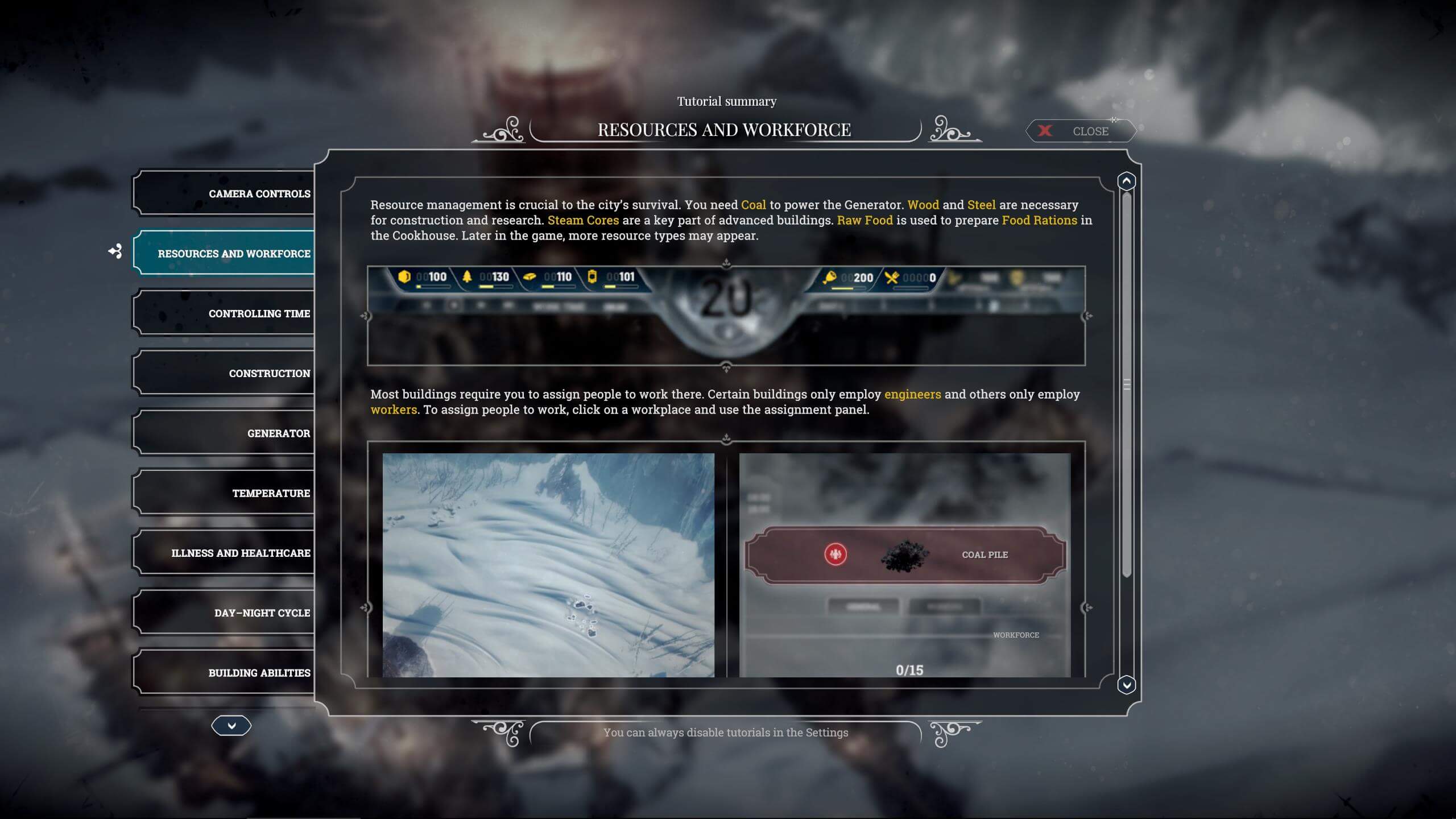
In the tutorial summary of Frostpunk, key terms are highlighted in yellow.
Credit: 11 bit studios S.A.. Screenshot captured by the author.
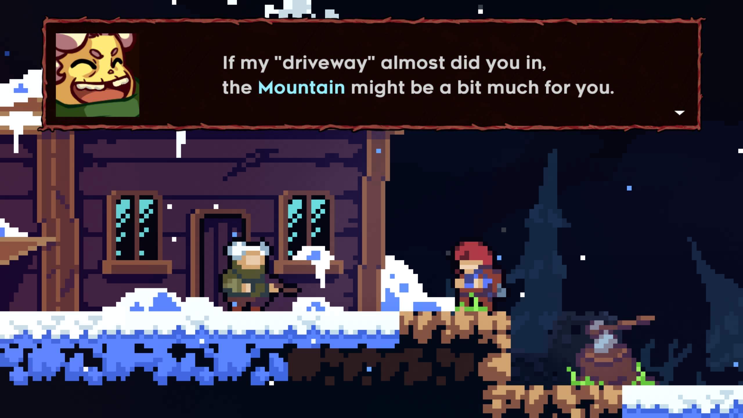
In Celeste, important words in dialogue appear in a color distinct from the rest of the text.
Credit: Extremely OK Games. Screenshot captured by the author.
However, overusing bold or vibrant colors can lead to visual clutter. If a majority of the text is highlighted while only a small portion remains in the default color, players may struggle to discern which information is truly important. Therefore, use bold coloring selectively and strategically.
Line Count
Avoid presenting large, uninterrupted blocks of text. Instead, break the content into paragraphs to improve readability and facilitate skimming.
Line Length
Longer lines of text generally reduce readability. For an optimal reading experience, limit line length to a maximum of 50 to 70 characters per line, including spaces and punctuation. This guideline should apply even when users adjust the text size, with the stated character count applying to the smallest permissible size.
Line Spacing
Line spacing, defined as the distance between two adjacent lines of text, should ideally fall between 120% and 150% of the text size. Values below 120% can make the text appear too dense, whereas values above 150% may hinder the reader’s ability to transition smoothly from one line to the next. If you reduce the text size, consider increasing the line spacing to maintain readability.
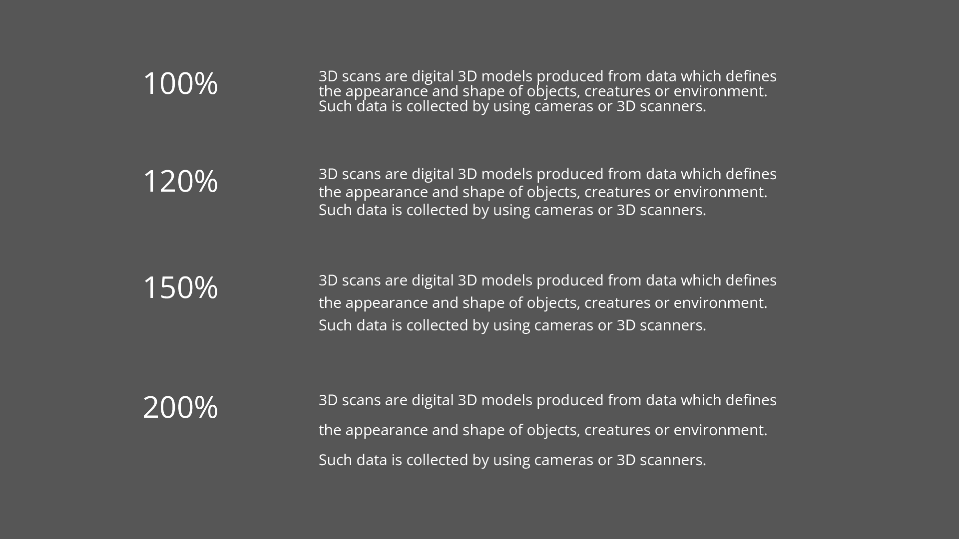
Four text blocks, each demonstrating a different line spacing value.
Placement
When a text block is associated with one or more interface elements, it should be positioned in close proximity to those elements to ensure players can quickly and intuitively understand the relationship.
If positioning the text near the relevant elements is not practical, consider the following alternatives:
Frame the related elements to visually group them with the text.
Highlight the elements to draw attention to their relevance.
Duplicate the label of the relevant graphic element and place it near the corresponding text block.