Make Important Information More Prominent
On this page
Players should be able to read and comprehend what your game’s graphical user interface (GUI) communicates within a moment. To enhance the readability of your GUI, consider implementing contrast effectively.
Contrast refers to the difference in color, density, direction, motion, position, space, shape, or size between various elements of the GUI. The higher the contrast, the better the readability you can achieve. However, when designing your GUI, it is essential to strike a balance—creating enough contrast to distinguish between elements of lesser and greater importance without compromising the aesthetic quality of the interface. Excessive or insufficient contrast can both negatively impact visual clarity and user experience.
When determining the placement and importance of visual elements on the screen, you may use one or more of the following types of visual contrast:
Contrast in Density
You can enhance players’ understanding of relationships between elements on the screen by grouping them spatially. Placing related elements closer together and spacing them evenly within clusters visually communicates their association. The smaller the spacing, the clearer it becomes that the elements belong to the same group.
Contrast in Direction
When positioning elements on the screen, consider arranging them to form visual paths. These arrangements can be shaped as follows:
Horizontal.
Vertical.
Diagonal.
Curved.
Complex.
When players observe that elements follow a directional alignment, such as a line or curve, they intuitively interpret these elements as contextually related.
Contrast in Visual Acuity
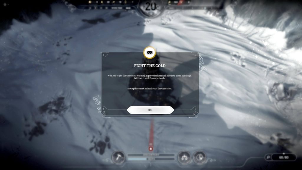
Visual acuity refers to the sharpness of elements on the screen. By default, elements are rendered sharply, but less important elements may be blurred to direct attention toward sharp, prominent elements. Apply blurring effects only to content that players do not need to read or focus on at a given moment.
In Frostpunk, the message titled “Fight the Cold” is designed to capture the player’s attention. Therefore, all visual elements within that message window are sharp, while the background and surrounding interface elements are blurred, as they are not important at that moment in gameplay.
Credit: 11 bit studios S.A.. Screenshot captured by the author.
Contrast in Position
To maintain immersion, GUI elements should be positioned in a manner that does not obstruct players’ view of key gameplay areas. In most cases, this focal area is the center of the screen. Regardless of the specific area of focus, always identify where players are most likely to be looking and position important elements so that they are visible with minimal eye movement, while less important elements require more effort to locate.
Contrast in Shape
Utilizing different shapes for visual elements based on their importance can:
Help players prioritize certain elements.
Facilitate easier interpretation of meaning, particularly for players with visual impairments.
For additional information on the use of shapes and their symbolic meaning, refer to the section Icons.
Contrast in Size
Varying the size of visual elements is a common method to communicate their relative importance. Generally, the larger the element, the more significant it is for the player.
However, increasing the size of important elements reduces the available screen space, which may present issues in already crowded areas. One solution is to hide less critical elements while preserving the enlarged size of key elements.
Contrast in Space
Providing additional space around visual elements can make them easier to locate and identify, as increased spacing naturally draws attention. It also improves interaction, such as clicking with a mouse. Be cautious, however, as excessive spacing may result in inefficient use of screen real estate.

